03 Jan Essential Elements of Web Typography: Two Case Studies 13th June 2016
Typography is famously an invisible art: if you’re noticing it, unless you’re a professional admiring another professional’s work, it’s probably because the typography is bad. Initially evolved for printed media, typography – the art of arranging types, whether letters or punctuation marks – is applicable anywhere there is text, and nowhere is there more text than on the Internet. With 4.68 billion web pages currently indexed, 95% of which are made up of text, a great deal of skill is need to organise information so that readers aren’t buried under an avalanche of words.
Even on a scale as small as a single website, comfortable navigation of the information presented is essential to the website’s success. And as most web pages change shape depending on the size of the screen being used, the typography needs to be flexible if it’s going to work across all platforms.
Choose Your Fonts Wisely
Traditional typography is rooted in good fonts. Our philosophy at Inspiral Design is that text needs to be treated as an object of beauty, not merely a means to communicate information. Fonts send an immediate signal to readers, before they’ve even had time to read the words, conveying emotional nuances or qualities a brand wishes to be associated with.
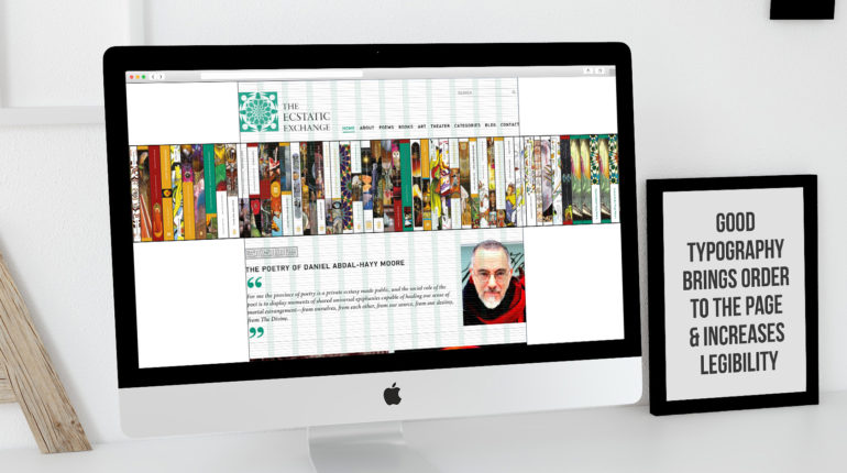
The curvature of the human eye means that we perceive everything to be rounded, which forces our brains to straighten out lines we know should be straight. Thus serif fonts such as Gentium, Arnhem or Garamond are thought to create an illusion of roundedness that tire the brain less, making them useful for large amounts of text. A nod to Roman capital letters, they also lend a classical air. When creating the website for renowned poet Daniel Abdal-Hayy Moore for example, which incorporated an ingenious virtual bookshelf, we used Minion for the main text to give a literary feel.
Although the range of fonts in Arabic is much more limited, there are also huge variations between the classical calligraphic styles and contemporary fonts. For the website of the University of Dammam in Saudi Arabia we used Univers for headings and Myriad Pro for the body text in the English version, sans serif fonts that give a clean, contemporary look, while in the Arabic version we chose Frutiger for the body text and Helvetica for headings.
Grotesques, sans serif fonts inspired by late 19th century types which are anything but ugly, are becoming more and more popular. There are plenty of playful fonts that can work for headings or brand logos however for screen display legibility should be considered. Choice of correct fonts are important and can heavily influence the tone of message and how your brand is perceived.
Finer Points Make For A Finer Product
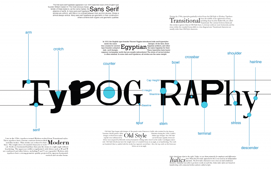
Typography is much more than simply headers and paragraphs, but aspects such as kerning (altering the space between letters), leading (altering the vertical spaces between lines, so named after the lines of lead originally used in laying out types), ligatures (little flourishes that connect certain letters), indentation, and plenty more.
The layout of the page itself is the background to all typesetting, and in the digital era we have come a long way from simply determining margins. For the website of poet Daniel Moore, we used a 9 pixel vertical grid to place all text boxes, images, headers, icons and so on, rather than the usual column format. This not only gave us a great degree of flexibility is the website build but also gives the site a sense of balance and visual harmony rarely seen in commercial websites.
Our speciality is incorporating Arabic with English texts, so for the website of the University of Dammam, we flipped the entire English site horizontally to create the right to left read Arabic version. This completely reversed the order of content flow as a native Arabic speaker would do when reading, but we were careful not to flip the photographs, as this can create problems especially if there is text within images.
The layout of a website naturally changes depending on the device being used, so websites need to be built with different break points that indicate the spacing for different screens. Instead of metric sizes we uses percentages so that the webpage and the font itself will scale to fit different devices. While this might give a classical typesetter a minor nervous breakdown, we see it simply as giving us more opportunities to create harmonious layouts.
Taking Typography Online
If you are building a website, bear in mind that not all fonts are Internet-compatible – particularly non-Latin scripts such as Arabic. ‘Canvas’ fonts, i.e. non-web fonts, won’t even be read by Google, so sites using these fonts won’t be indexed or show up in a search. On top of that, the unpredictability of different users’ screens means you are more or less obliged to entrust your typography to CSS file rather than coding it into the HTML.
This initially feels like a leap into the dark for most typographers. But even though it takes away the web developer’s control over subtle aspects of typesetting, such as eliminating rivers (white lines that seem to run vertically through text), or widows and orphans (sentences that are broken leaving a few words at the top or bottom of a page), it does means that maintaining or altering your website will be a breeze – especially if it’s very page-heavy.
The possibilities offered by web typography compared to print, however, are phenomenal. The virtual bookshelf on the Ecstatic Exchange site uses 3D virtual text – unusually for the web – to represent the books turning to face forwards, rotating the text on a 3D plane. This kind of multimedia experience was unthinkable back in the days of metal type, and gives a free pass to the web designer’s imagination.
True aficionados of web typography, such as those working with us at Inspiral Design, can converse fluently in codes relating to ems, automated word-breaks, and subpixel anti-aliased font smoothing, but fortunately our clients don’t have to take an evening course to understand them. Our decades of combined experience makes the process of designing beautiful, readable text, an intuitive experience – whether in print or online.